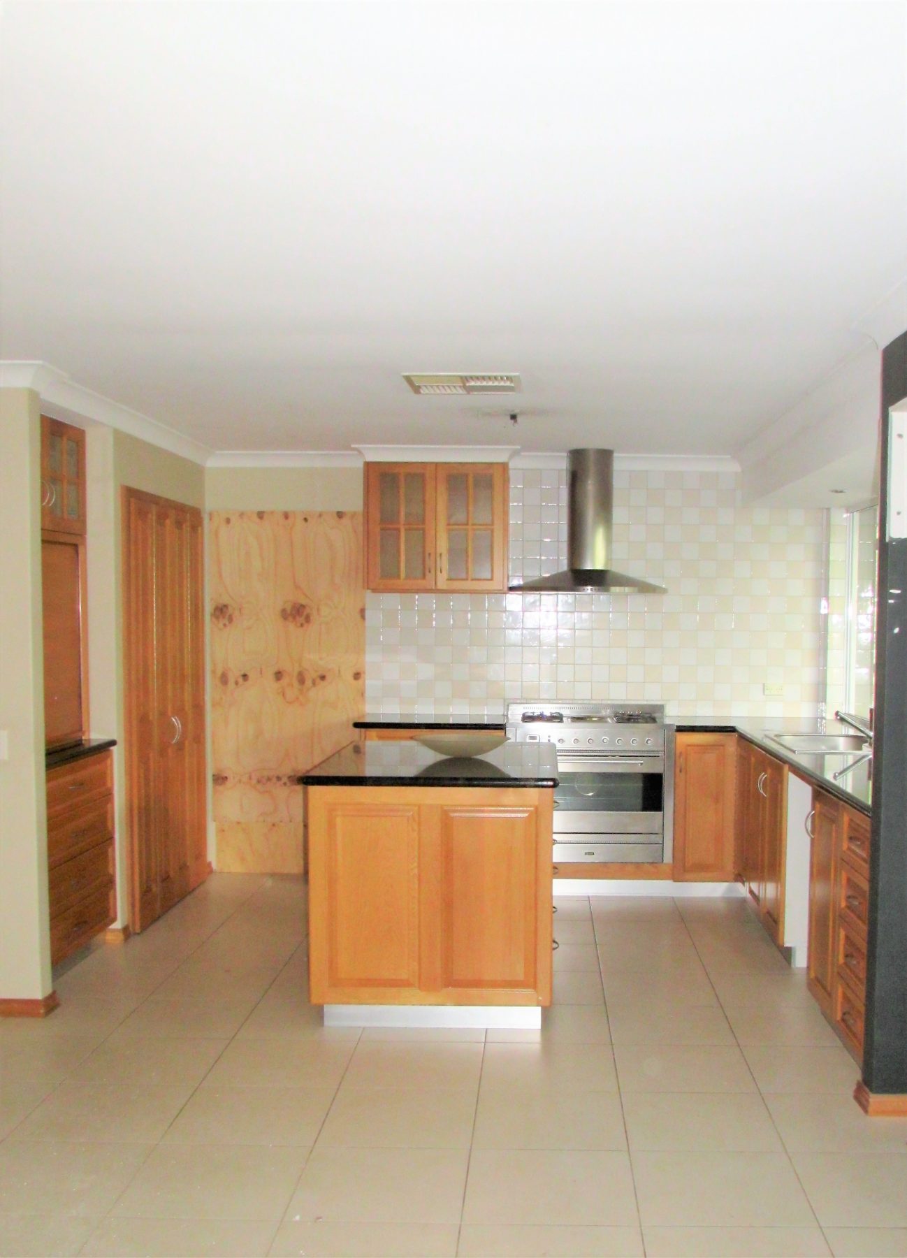
The old adage of a little makes a big difference rings truer in some instances than others. And never a truer case than in this renovation of a kitchen/dining area (the kitchen cabinets remained but everything else was up for grabs). I’d add, that the ensuite, laundry, powder room and master bedroom had a full re-work too and without taking anything away from the net result (you’ll love the ensuite transformation), I wanted to focus on the kitchen for if it was a culinary dish it would most definitely be the piece de resistance. For clarity, the figures mentioned below refer to the kitchen and associated works in isolation.
While added space was a prerequisite, light was a necessity too.
When we talk about adding space, I speculate that few would consider a scope of works with less than 15-20 square meters (sqm). If the Olympic committee pondered introducing non-sporting events in the Games and settled on an event for the least square meterage added in a structural renovation, then aside from the entire committee being fired for completely losing their marbles, hands down this project would be proudly representing Australia with a podium finish clearly in sight! Wait for it….a smidge over 4sqm!
“Mathematically, they’ve managed to take 2 + 2 and arrive at 5”.
Now, before you jump back to my previous blog ‘How Much per sqm Please?!’, this one safely sits in a box of its own; entirely making the premise of sqm ballparks null-and-void in renovating terms. For surely the Guinness Book of Records would be knocking on the door if equations alone took the place of judges, pitching this renovation at around $32,500 per sqm – gold!
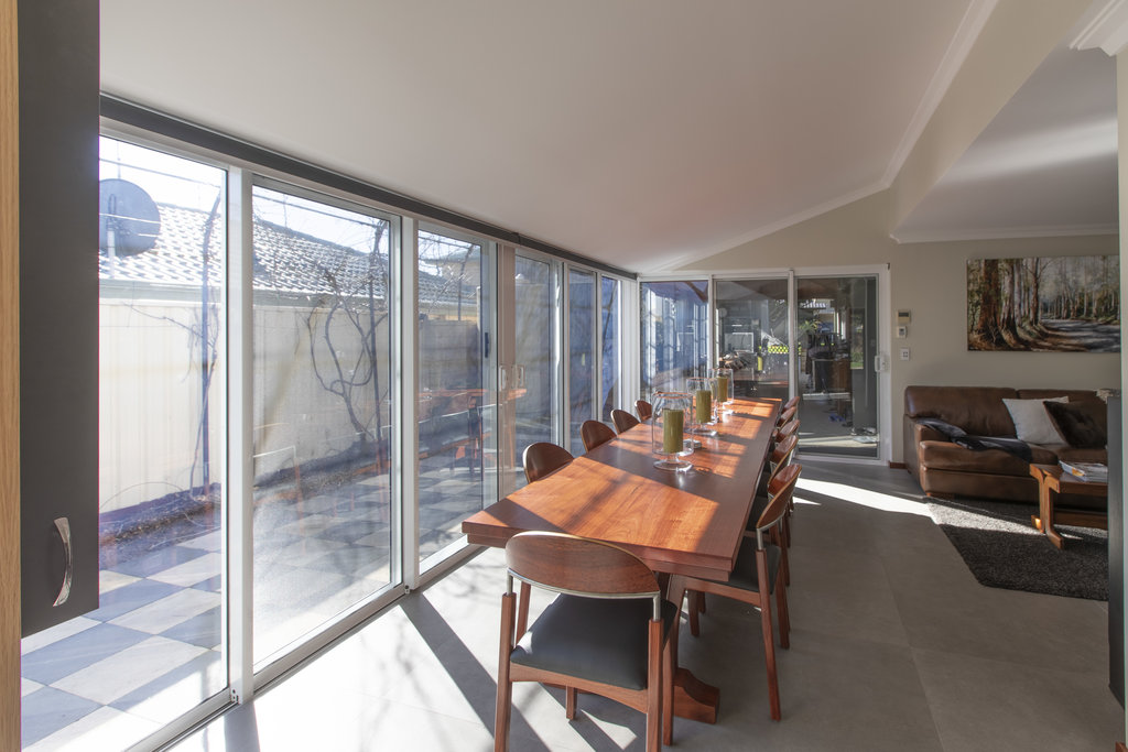
What makes it truly special was the client’s idea (dare I say it, genius, or tantamount to highly creative, idea) to rake part of the ceiling where the existing roofline intersected the second storey juncture, in a bold move to utilise the existing structure and change the entire dynamic of the space below.
Not only did the floor plan gain 4sqm, the ceiling ‘space’ in the same area jumped nearly 13sqm. It’s the equivalent of doing an attic conversion, without the attic!
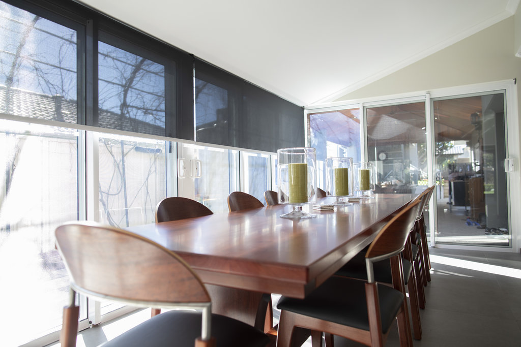
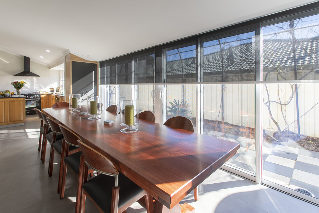
Back to the high-value land-grab and what they gained in extra floor area. As is common-place in many renovations, stacker doors (terrific job by the guys and girls at SV Glass) provided the opportunity to increase light dramatically while creating a new dining area, allowing the old dingy and cramped dining space to be converted into a walk-in pantry. Mathematically, they’ve managed to take 2 + 2 and arrive at 5.
Where what you can’t see makes what you can see possible then here, the detail is fundamentally hidden. To maximise the extent to which the existing floor could be increased (simply to the edge of the existing eaves-line ie. 700mm) three steel columns picked up a narrow overhead beam enabling the door height to remain consistent and the structure of the roof to be notched into the beam, with little alterations in the roof space.
“Simple ideas can function brilliantly”.
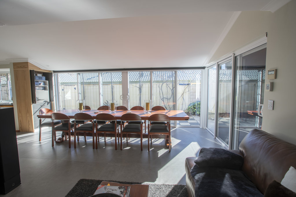
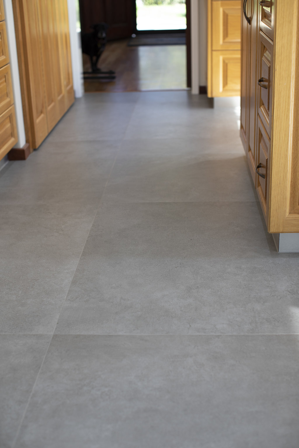
At ground level, the sills were recessed into the concrete with only 1mm tolerance, to marry up with new tiles and a flush exit. The Kerlite tiles are 1000mm x 1000mm and only 3.5mm thick (thin!), laid directly onto the existing floor tiles, so, little room for error. For those that haven’t seen these tiles before, they’re pretty cool! While not a ‘cheap’ option per se, they have a distinct advantage of being able to be laid directly onto existing tiles and due to their ‘thinness’, doors don’t need trimming and levels are only slightly affected. From a technical perspective, they are environmentally-friendly, being fired in non-Co2 generating kilns, ceramic, perfectly flat and easy to work with. Check them out here.
The raked ceiling finishes snugly above the door heads and propels the newly invited light upwards, creating a feeling of space far greater than the area itself permits.
What appeals significantly about this renovation is that the kitchen cabinets and benchtops, usually king of the domain, remained untouched while the entire focus was on generating light and reinventing the space around them. It’s often easy to overlook transforming ideas or indeed not see them in the first place.
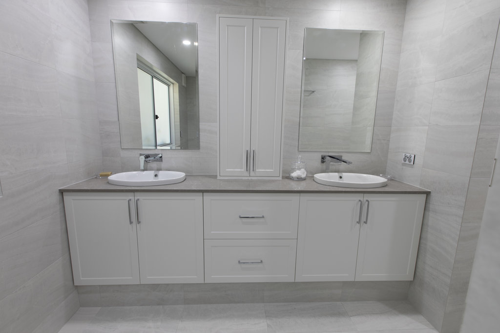
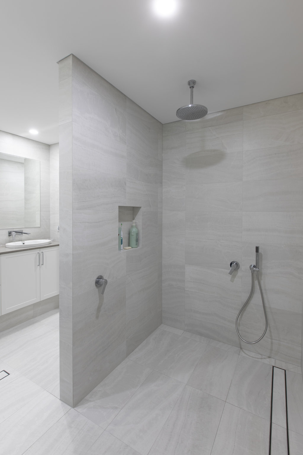
As mentioned, while playing ‘second fiddle’ to the kitchen, I couldn’t end without further mention of the ensuite transformation. It’s a renovation equivalent of Hans Christian Andersen’s Ugly Duckling!
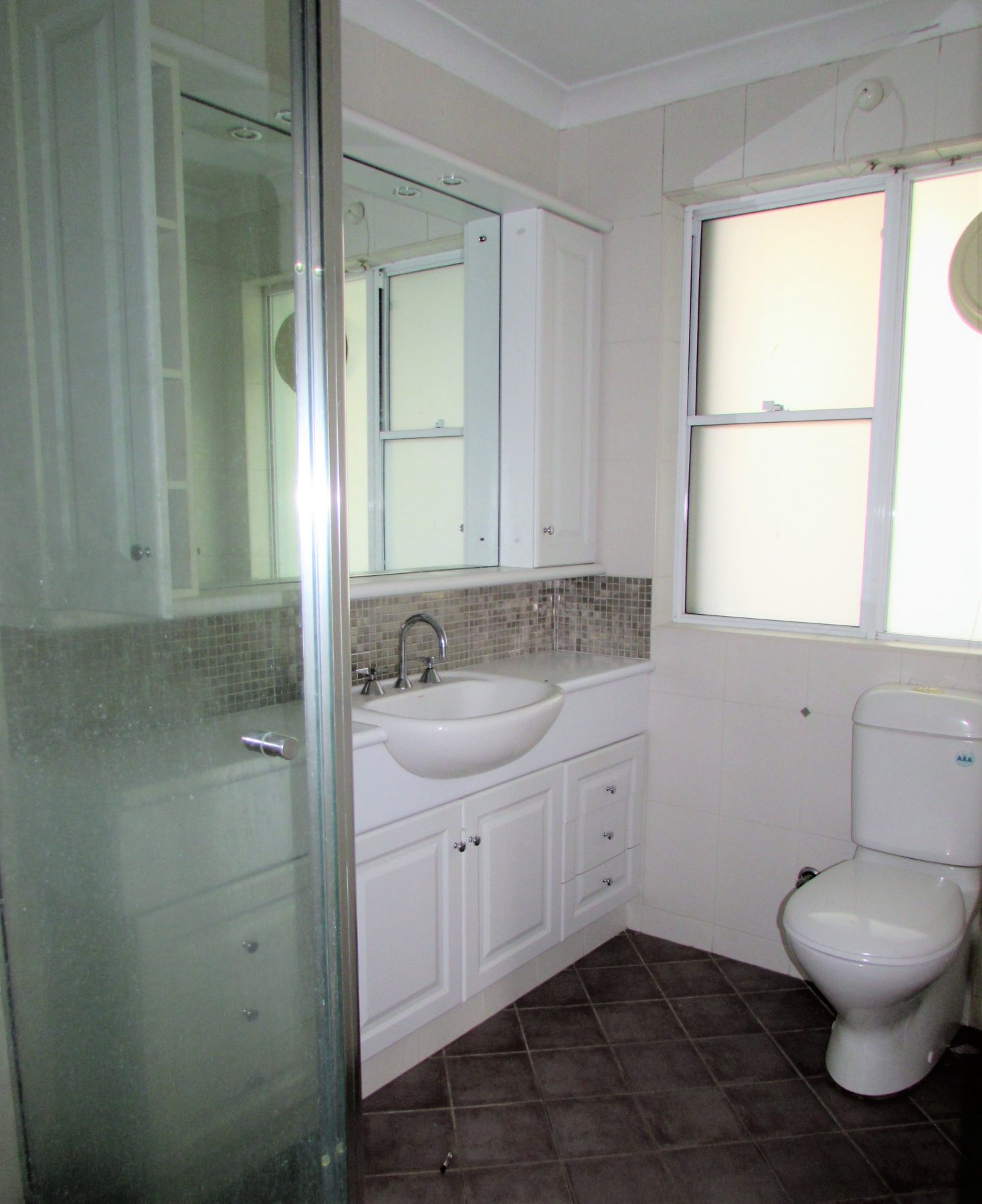
The original ensuite was, in fairness, the other half of the ‘walk-in-robe/ensuite’ combo, It sat fairly uncomfortably off the WIR in a dated and cramped fashion and while it provided all the amenities required of it, there was little room to navigate between the shower, vanity and WC without risk of potential injury.
The plan involved removing a doorway and part of the wall to open up the entire area and relocate the robe space to the master bedroom, which was more than accommodating and welcomed it without fuss.
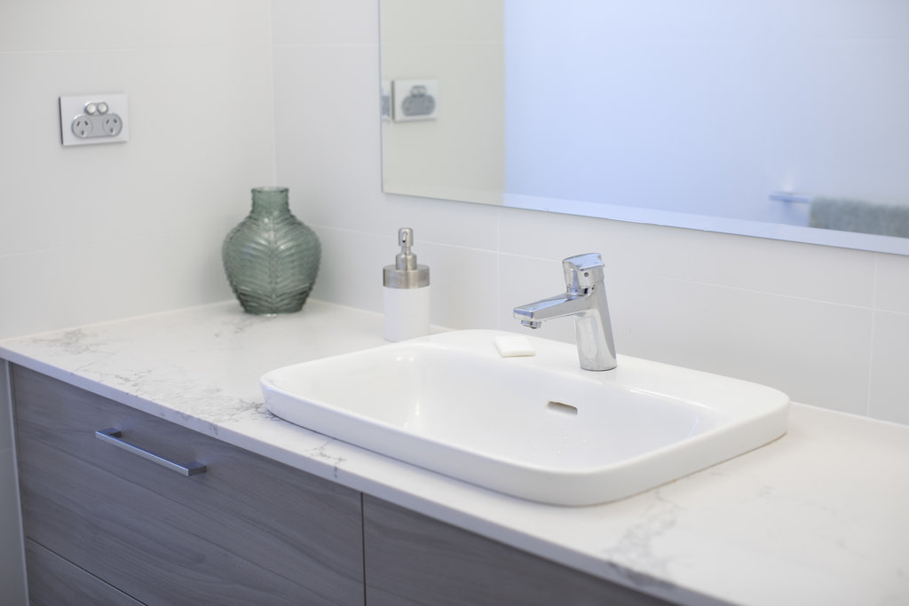
Removal of the existing windows and concrete slab, enabled a remodelling exercise most cosmetic beauty salons would be proud of. Bigger windows, new plumbing, drop-ceiling, bench seating and floor-to-ceiling tiling have assisted in making this much more than a make-over and most definitely a younger model.
Both the works in the kitchen and the ensuite, show that creativity in design comes from many places and isn’t the sole domain of an architect, designer or builder. Simple ideas can function brilliantly, spaces can be transformed without great expense and kitchen renovations don’t always involve new kitchens!